Life Sciences · Scientific communication
Science Clarity
A refined identity and platform for a scientific communication practice.
The Science Clarity mark, rebuilt as vector artwork, anchors one visual system across a new site. The brand reads with the same clarity the practice sells.
IndustryLife SciencesScientific communication
ServicesBrand and Creative, Digital Infrastructure
EngagementLogo rebuild, visual system, and website for the relaunch
Websitescienceclarity.com
The challenge
Clarity is the product, so the brand has to show it.
Science Clarity helps research teams make their expertise valuable to the people who need it. Its founder, Sonya Snedecor, PhD, spent 17 years in health economics and outcomes research, showing payers and policymakers the value of healthcare interventions.
The mark already carried recognition, a circle with SCIENCE above CLARITY, and the brief was to keep both. It existed only as an image file, so it held up at one size and on one background. The relaunch brought the mark, the pages, and the platform onto one standard.
Built to the standard it sellsResearch teams judge a clarity practice by its own materials first. SCIENCE now leads the mark, and one palette and one typeface hold every page to the same standard.
The approach
One commercial engine.
The engagement covered the identity and the platform. The mark came first, because every page carries it, then color, type, and the build.
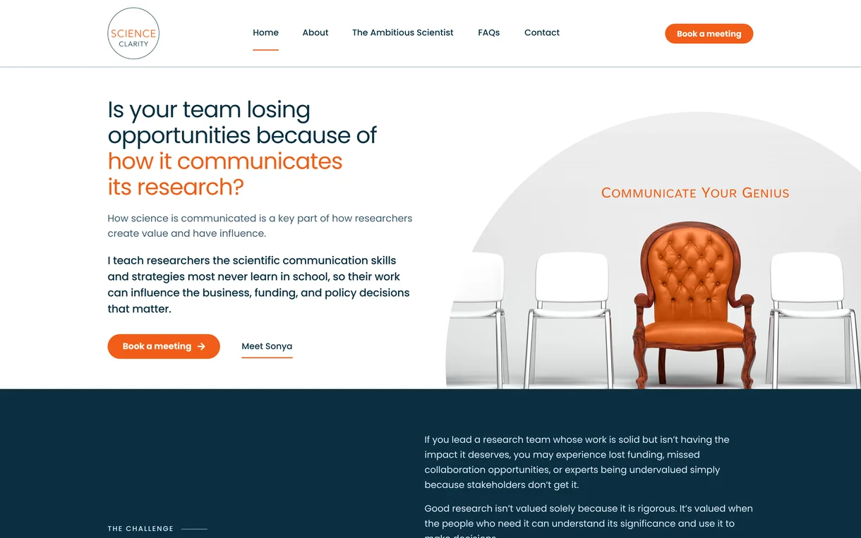
The mark redrawn as vector artwork for every size and background, with SCIENCE as its focal point. Navy and orange from the existing palette carry the brand over quiet sand and white grounds, set in Poppins. The circle from the mark returns as the frame for the hero photograph.
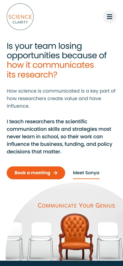
The site was rebuilt on a platform where colors, type, and buttons are set once and apply to every page. A meeting is one click from any page, and on a phone the booking bar stays in reach. Each layout was checked at phone, tablet, laptop, and desktop widths.
The impact
Clarity, at a glance.
The mark now holds up at every size, on light grounds and dark, from one consistent set of files.Every page draws on one set of colors, type, and buttons, so each new page starts on brand.
What we delivered
The work, itemized.
- Logo redrawn as vector artwork
- Logo suite for web, print, and social
- Color and type system
- Website design
- Platform build and page migration
- Header, navigation, and footer
- Meeting booking in the header, with a sticky bar on phones
- Responsive layouts for desktop, tablet, and phone
Next projectOncidium foundation